

Post Date
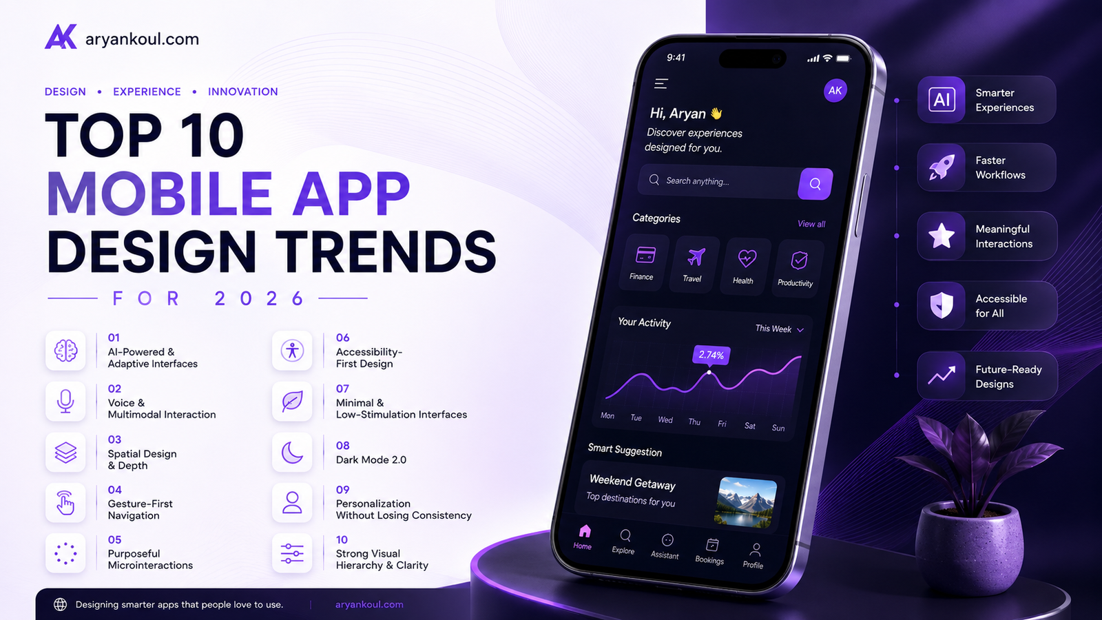
Mobile app design is changing quickly in 2026. Users are no longer impressed simply because an app looks modern. They expect apps to be faster, smarter, easier to navigate, personalized to their needs, and accessible across different situations.
Artificial intelligence is also changing what an app interface can be. Instead of every user seeing exactly the same screens, apps can increasingly adapt content, navigation, and actions based on context and behavior. At the same time, voice interaction, spatial interfaces, accessibility, and more purposeful motion are becoming important parts of the mobile experience.
So, what should designers and businesses pay attention to in 2026?
Here are the 10 biggest mobile app design trends shaping the year.
One of the biggest changes in mobile app design is the move from static interfaces to interfaces that can adapt to individual users.
Traditional apps usually give everyone the same navigation, menus, and recommendations. AI-powered interfaces can make those experiences more personalized.
For example, a shopping app could learn which categories a customer visits most often and make those products easier to access. A productivity app could prioritize upcoming tasks based on deadlines and previous behavior.
The important part is that personalization should feel helpful rather than confusing. Users should still understand where things are and how the app works.
Design takeaway: Use AI to personalize content, recommendations, and workflows while keeping the core navigation consistent.
AI is moving beyond chatbots.
In 2026, designers are increasingly thinking about interfaces where users describe an outcome and the app helps complete the task instead of forcing them through multiple screens.
For example, instead of opening a travel app, searching for flights, selecting dates, comparing options, and completing several steps, a user might simply say:
“Find me the cheapest flight to London next weekend.”
The system can then handle much of the process.
This shift toward intent-based interaction is part of a broader movement toward AI-first mobile experiences, where the user’s goal becomes more important than navigating through a traditional app structure.
Design takeaway: Design around user goals and tasks, not just individual screens.
Typing isn’t always the easiest way to interact with an app.
Voice interfaces are becoming more useful, particularly when users are driving, cooking, exercising, or simply don’t want to type. But voice doesn’t necessarily need to replace visual interfaces.
The stronger approach is multimodal design.
A user might speak a command, see the result visually, and then use touch to make the final selection.
For example:
Voice: “Show me my recent transactions.”
Visual: The app displays the transactions.
Touch: The user taps one transaction to view its details.
This combination can make apps feel much more natural.
Design takeaway: Give users multiple ways to complete important actions instead of forcing every task through touch and typing.
Flat interfaces aren’t disappearing, but mobile design is becoming more spatial.
Designers are using subtle layers, translucency, blur, elevation, shadows, and depth to establish hierarchy between interface elements. Rather than adding effects simply to make a screen look attractive, depth can communicate what is interactive and what should receive attention.
Think about a bottom sheet appearing above a blurred background. The user immediately understands that the sheet is the active layer.
The same principle can be used for:
Floating controls
Dialog boxes
Navigation elements
Media players
Maps
Product previews
Interactive cards
Design takeaway: Use depth to improve hierarchy and usability, not simply for decoration.
Touch gestures have become a natural part of how people use smartphones.
In 2026, designers are going further by using gestures where they genuinely make interactions faster.
Examples include:
Swiping between content
Pulling down to refresh
Long pressing for additional actions
Dragging cards
Pinching to zoom
Swiping to dismiss
Edge gestures for navigation
However, gesture-based design has one major challenge: discoverability.
If an important action can only be performed through a hidden gesture, many users may never find it.
Design takeaway: Use gestures to speed up common actions, but provide visible alternatives for important functionality.
Small animations can have a surprisingly large impact on how an app feels.
A button that responds when tapped, a progress indicator that smoothly updates, or a confirmation animation after completing an action can provide useful feedback.
These are called microinteractions.
In 2026, the focus is shifting away from animation for animation’s sake. Motion should communicate something.
For example:
A loading animation tells users something is happening.
A button animation confirms their tap.
A transition shows where content came from.
A success animation confirms an action.
A subtle vibration can reinforce an interaction.
The best motion is often the motion users barely notice—but immediately understand.
Design takeaway: Every animation should have a purpose: feedback, orientation, hierarchy, or continuity.
Accessibility is no longer something designers should add at the end of a project.
A good mobile interface should work for users with different visual, motor, hearing, and cognitive needs.
That means thinking about:
Readable typography
Sufficient contrast
Large enough touch targets
Screen-reader support
Clear error messages
Captions for video
Reduced-motion preferences
Simple and predictable navigation
This becomes even more important as AI-generated interfaces become more common. Research into AI interfaces has highlighted the importance of keeping generated experiences understandable, accessible, and controllable by humans.
Design takeaway: Accessibility should be part of the design system from day one, not a final checklist.
After years of increasingly complex interfaces, designers are moving toward calmer experiences.
Users are surrounded by notifications, pop-ups, recommendations, animations, advertisements, and endless content. A mobile app that constantly demands attention can quickly become exhausting.
This is creating demand for interfaces that are:
Cleaner
More focused
Less distracting
Easier to scan
More intentional
Minimal design doesn’t mean removing everything.
It means removing things that don’t help the user accomplish their goal.
For example, a finance app doesn’t need five animated charts on its home screen if the user’s main goal is simply checking their balance.
Design takeaway: Ask whether every element earns its place on the screen.
Dark mode has been around for years, but it continues to evolve.
Modern dark interfaces are becoming more sophisticated than simply replacing white with black.
Designers are using different levels of darkness to establish hierarchy:
Deep background
Slightly lighter cards
Elevated surfaces
Subtle borders
Carefully controlled accent colors
This creates a layered interface without requiring excessive shadows or decoration.
Dark mode can also be particularly useful for apps used in low-light environments, entertainment apps, productivity tools, and media applications.
Design takeaway: Treat dark mode as a complete design system rather than an inverted version of light mode.
Personalization is becoming one of the defining ideas of mobile UX in 2026.
But there’s a fine line between an app feeling personalized and an app feeling unpredictable.
An adaptive interface might change the order of content, recommendations, shortcuts, or frequently used actions. However, fundamental elements such as navigation patterns, terminology, and interaction behavior should remain familiar.
The strongest adaptive designs personalize what users see and prioritize, while keeping the underlying interface understandable.
For example, a fitness app might show running-related shortcuts to a frequent runner while showing strength-training shortcuts to another user.
Both users are still using the same app—the experience is simply more relevant to each person.
Design takeaway: Personalize the experience without constantly changing the user’s mental model of the app.
Not every trend needs to be added to every app.
A banking application doesn’t need to look like a gaming app, and an e-commerce application doesn’t necessarily need an AI agent.
Instead, choose trends based on what actually improves the user’s experience.
For most businesses in 2026, these are the areas worth prioritizing:
| Trend | Potential Impact |
|---|---|
| AI-powered interfaces | ⭐⭐⭐⭐⭐ |
| Agentic UX | ⭐⭐⭐⭐⭐ |
| Accessibility-first design | ⭐⭐⭐⭐⭐ |
| Personalization | ⭐⭐⭐⭐⭐ |
| Voice & multimodal UX | ⭐⭐⭐⭐ |
| Spatial/depth design | ⭐⭐⭐⭐ |
| Gesture-based navigation | ⭐⭐⭐⭐ |
| Purposeful microinteractions | ⭐⭐⭐⭐ |
| Minimal/low-stimulation UI | ⭐⭐⭐⭐ |
| Advanced dark mode | ⭐⭐⭐ |
The biggest mobile app design trend of 2026 isn’t really a particular color palette, animation style, or visual effect.
It’s the move toward more intelligent and human-centered experiences.
AI is making interfaces more adaptive. Voice and gestures are giving users more ways to interact. Spatial design is adding depth and hierarchy. Accessibility is becoming a fundamental requirement, while minimal interfaces are helping users focus on what actually matters.
At the same time, designers shouldn’t chase every new trend simply because it is popular.
A great mobile app still needs the fundamentals: clear navigation, fast performance, strong visual hierarchy, intuitive interactions, accessibility, and a genuine understanding of the user’s needs.
The best designs in 2026 will be the ones that use new technology to make those fundamentals better—not the ones that simply add more technology to the screen.
Adamson Janny
Crafting unique, memorable website that perfectly represent your brand identity, combining creativity, precision, & innovation to make your business stand out.
© Copyright 2026 Aryan koul - All Rights Reserved.
Terms & Conditions
Privacy Policy