

Comments
Designer
Post Date
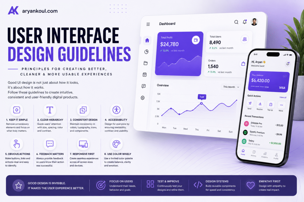
A great digital product doesn’t need to be complicated to be impressive.Whether you’re designing a mobile app, website, SaaS platform, dashboard, or e-commerce store, the interface plays a major role in how users understand and interact with your product. A beautiful interface may attract attention, but a well-designed user interface (UI) makes people want to keep using it. Good UI design helps users find information, complete tasks, and navigate a product without unnecessary confusion.But what makes an interface genuinely good?The answer comes down to a combination of clarity, consistency, accessibility, usability, visual hierarchy, and thoughtful interaction design.In this guide, we’ll explore the most important user interface design guidelines every designer should understand.
User Interface Design is the process of designing the visual and interactive elements of a digital product.
This includes everything users see and interact with, such as:
The goal isn’t simply to make an interface look attractive.
The goal is to create an experience where users can understand what they are seeing and know what to do next.
A good interface feels natural. Users shouldn’t have to stop and think about how basic features work.
One of the most important UI design principles is simplicity.
When users open an application or website, they shouldn’t be overwhelmed by dozens of buttons, animations, colors, and competing messages.
Instead, identify the primary goal of each screen.
For example, the main purpose of a checkout page is to help users complete their purchase. It shouldn’t distract them with unnecessary promotional content.
A simple interface can:
However, simplicity doesn’t mean removing useful features.
Good UI design removes unnecessary complexity, not functionality.
Not every element on a screen has the same level of importance.
Visual hierarchy helps users understand what they should look at first, second, and third.
You can create hierarchy through:
For example, a typical landing page might follow this structure:
Headline → Supporting text → Primary CTA → Additional information
The headline gets the most attention, while secondary information receives less visual emphasis.
Without hierarchy, every element competes for attention.
When everything is important, nothing feels important.
Consistency makes an interface easier to learn.
If one button uses purple with rounded corners and another page uses a completely different style for the same action, users may become confused.
Create consistent rules for:
For larger products, this is where a design system becomes extremely valuable.
A design system allows designers and developers to reuse established components instead of creating every interface element from scratch.
Typography is more than choosing a nice-looking font.
It affects readability, hierarchy, personality, and accessibility.
A good interface should have a clear typographic system with different levels for:
Avoid using too many font families.
In most interfaces, one or two complementary typefaces are enough.
Also pay attention to:
Line height: Text should have enough vertical space to remain comfortable to read.
Font size: Small text can become difficult to read, especially on mobile devices.
Line length: Extremely long paragraphs can make reading tiring.
Contrast: Text should be sufficiently distinguishable from its background.
Great typography can make even a simple interface feel premium.
A beautiful interface isn’t truly successful if some users can’t use it.
Accessibility should be considered from the beginning of the design process.
Important considerations include:
For example, don’t communicate an error only by changing a field to red.
Instead, combine the color change with an understandable message such as:
“Password must contain at least 8 characters.”
This makes the interface clearer for everyone.
Users should be able to understand where they are and where they can go.
Navigation should feel predictable across the entire product.
For websites, common navigation patterns might include:
For mobile applications, bottom navigation may provide access to the most important areas.
The exact structure depends on the product, but the principle remains the same:
Don’t make users guess where something is.
If users repeatedly need to search for basic features, the navigation needs improvement.
Interactive elements should look interactive.
A button should generally look different from ordinary text.
Good buttons usually communicate:
Instead of using vague labels such as:
“Click Here”
use descriptive labels such as:
“Start Free Trial”
or
“Download Report”
The user should understand the result of the action before clicking.
Users need confirmation that their actions have been recognized.
Imagine clicking a payment button and seeing absolutely nothing happen.
You might wonder:
“Did it work?”
That’s why interfaces need feedback.
Examples include:
Even a simple state change can reassure users that the system is responding.
Good feedback reduces uncertainty.
A modern interface needs to work across different devices.
A website might be viewed on:
The layout shouldn’t simply shrink when the screen gets smaller.
Instead, responsive design should consider how content should rearrange, resize, hide, or prioritize itself.
For example, a three-column desktop layout might become a single-column mobile layout.
Navigation may transform into a mobile menu.
Images may resize or crop differently.
Responsive design is therefore not just about making things smaller. It’s about creating an appropriate experience for each screen.
Color can communicate hierarchy, emotion, status, and brand identity.
But using too many colors can make an interface feel chaotic.
A practical color system might include:
Use accent colors strategically.
For example, if every button on a page is bright purple, users may struggle to identify which action is the most important.
Reserve stronger visual emphasis for important actions.
Empty states are often overlooked during UI design.
What happens when a user doesn’t have any data?
For example:
No saved projects yet.
Simply displaying an empty screen isn’t very helpful.
A better empty state could include:
No projects yet
“Create your first project to get started.”
+ Create Project
This transforms an empty screen into an opportunity to guide the user.
Good empty states should explain:
Forms are one of the most common places where users experience frustration.
A well-designed form should be as short and straightforward as possible.
Consider:
Don’t ask users for information you don’t actually need.
Every additional field creates another opportunity for the user to abandon the process.
Icons can make interfaces easier to scan, but they shouldn’t replace clarity.
For familiar actions, icons can work extremely well:
But unfamiliar icons can create confusion.
When an icon isn’t immediately understandable, consider adding a text label or tooltip.
Also maintain consistency in:
A collection of icons from completely different visual styles can make an otherwise polished interface feel inconsistent.
Animation can make an interface feel responsive and alive.
But excessive animation can quickly become distracting.
Use motion when it helps:
For example, a card smoothly expanding when selected can help users understand the relationship between the collapsed and expanded states.
Animation should support the experience rather than become the experience.
If an animation looks impressive but makes the interface slower or harder to use, it probably isn’t helping.
One of the biggest mistakes in UI design is designing only for the ideal scenario.
Real users make mistakes.
They:
Your interface should be prepared for these situations.
Think about:
What happens if something goes wrong?
Designing error states, loading states, offline states, and empty states can make a product feel significantly more polished.
Mobile interfaces require special attention because users interact with them differently from desktop interfaces.
Consider:
Don’t simply take the desktop version and shrink it.
A strong mobile experience should be designed around the limitations and advantages of the device.
Even experienced designers can make assumptions that turn out to be wrong.
That’s why usability testing is so important.
Watch real users interact with your interface and look for moments where they:
These observations can reveal problems that aren’t obvious from a design file.
You don’t always need a huge research budget.
Even testing a prototype with a small number of representative users can reveal valuable usability problems.
UI design isn’t finished when the product launches.
Analytics, user feedback, support requests, usability tests, and conversion data can reveal opportunities for improvement.
A good design process is continuous:
Design → Build → Test → Measure → Improve
Over time, small improvements can have a significant impact on the overall user experience.
Before launching a website or application, ask:
Great UI design isn’t about making every screen look impressive.
It’s about making the product easy to understand, easy to use, and enjoyable to interact with.
The best interfaces combine visual design with usability. They guide users without overwhelming them, provide feedback without creating noise, and make complex functionality feel simple.
Whether you’re designing a mobile app, SaaS platform, e-commerce website, or personal portfolio, these principles provide a strong foundation.
And perhaps the most important guideline is this:
Design for the person using the product, not just for the person looking at the design.
When usability comes first, beautiful design becomes much more powerful.
Crafting unique, memorable website that perfectly represent your brand identity, combining creativity, precision, & innovation to make your business stand out.
© Copyright 2026 Aryan koul - All Rights Reserved.
Terms & Conditions
Privacy Policy