

Author
Post Date
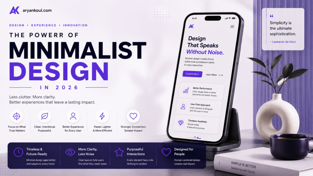
In a world filled with notifications, pop-ups, animations, advertisements, and endless content, simplicity has become more valuable than ever.
This is why minimalist design is becoming one of the most important design approaches in 2026. From mobile apps and websites to dashboards and digital products, brands are increasingly removing unnecessary elements and focusing on what actually matters: creating an experience that is clear, fast, intuitive, and enjoyable.
But minimalist design doesn’t simply mean using a white background and fewer elements.
Modern minimalism is about purpose.
It asks a simple question: Does this element help the user?
If the answer is no, it probably doesn’t belong there.
Minimalist design is an approach that focuses on reducing visual and functional clutter while keeping the most important elements highly visible.
A minimalist interface typically uses:
Clean layouts
Strong visual hierarchy
Limited color palettes
Generous whitespace
Simple typography
Clear navigation
Purposeful imagery
Subtle animations
Consistent design systems
The goal isn’t to make a design look empty. The goal is to make it easy to understand.
A good minimalist website can have dozens of features behind the scenes while presenting users with only the information they need at the right moment.
Users interact with hundreds of digital experiences every month. They don’t want to spend time figuring out how a website works or searching through complicated menus.
They want answers quickly.
This has made simplicity a competitive advantage.
A clean interface can help users:
Find information faster
Understand products more easily
Complete actions with fewer distractions
Navigate websites more confidently
Focus on important content
Build trust in a brand
Minimalism also works particularly well on mobile devices, where screen space is limited and every element competes for attention.
One of the biggest principles of modern minimalism is removing unnecessary visual noise.
Consider a homepage with:
Five different promotional banners
Multiple pop-ups
Several competing buttons
Large blocks of text
Too many colors
Multiple animations
Even if every element has a purpose individually, the overall experience can become overwhelming.
A minimalist approach would identify the primary goal of the page and build the experience around it.
For example, an agency website might focus its hero section on three things:
What we do.
Why we’re different.
What you should do next.
Everything else can come later.
Whitespace is one of the most powerful tools in minimalist design.
It doesn’t necessarily mean the space has to be white. It simply refers to the empty space surrounding elements.
Good use of whitespace creates breathing room between:
Headings and paragraphs
Images and text
Buttons and other controls
Sections
Navigation elements
Instead of trying to fill every available pixel, designers in 2026 are increasingly allowing important elements to breathe.
The result is a layout that feels more premium, organized, and intentional.
When there are fewer decorative elements, typography becomes much more important.
A strong minimalist design can often rely on typography to create most of its visual personality.
This means paying attention to:
Font selection
Font weight
Line height
Letter spacing
Font size
Text hierarchy
Contrast
A powerful headline can communicate more than a complicated graphic.
For example:
“Build Better Digital Experiences.”
A simple headline with strong typography and generous spacing can create more impact than a screen filled with visual effects.
Minimalist design doesn’t mean using only black and white.
Instead, modern minimalism often uses a carefully controlled palette.
A design might have:
One primary brand color
One accent color
Neutral backgrounds
One or two text colors
This creates consistency throughout the website or application.
For brands, this is particularly valuable because users can begin associating specific colors, typography, and visual patterns with the brand.
The key is not having fewer colors just for the sake of it. The key is using every color intentionally.
Minimalist design doesn’t have to be static.
In fact, subtle motion can make a minimalist interface feel much more sophisticated.
Instead of large animations everywhere, designers can use small interactions such as:
A button gently changing when hovered
A card subtly lifting when selected
A smooth page transition
A progress indicator
A menu sliding into view
A small confirmation animation
These interactions provide feedback without distracting users.
The principle is simple:
Motion should communicate, not compete.
Artificial intelligence is changing how digital products work.
AI-powered applications can now personalize recommendations, generate content, summarize information, automate tasks, and assist users with complex workflows.
But AI can also make interfaces more complicated.
That’s where minimalist design becomes especially important.
Instead of showing users dozens of AI controls, designers can hide complexity behind simple interactions.
For example, rather than presenting a user with multiple technical settings, an AI design tool could simply ask:
“What would you like to create?”
The technology can handle the complexity in the background.
This creates a powerful combination:
Complex technology + simple interface = better user experience.
Mobile screens leave very little room for unnecessary content.
This makes minimalism particularly effective for mobile applications.
A good mobile interface should make the most important actions immediately understandable.
For example, an e-commerce app might prioritize:
Search → Categories → Products → Cart
rather than filling the home screen with every possible feature.
Large touch targets, clear navigation, readable typography, and focused content can make a mobile experience significantly easier to use.
Design affects how people perceive a brand.
A cluttered website can sometimes feel outdated, confusing, or difficult to trust. A carefully designed minimalist interface can communicate professionalism and confidence.
This is particularly important for:
Financial websites
SaaS platforms
Healthcare applications
Technology companies
Professional services
E-commerce brands
When a business presents information clearly, users often feel more comfortable interacting with it.
Good design doesn’t need to shout.
Sometimes confidence comes from knowing when to stay quiet.
Minimalist design can also support accessibility when implemented correctly.
Clear typography, strong contrast, predictable navigation, sufficient spacing, and simple interaction patterns can make digital experiences easier for a wider range of users.
However, designers should remember that minimal doesn’t automatically mean accessible.
Removing labels, reducing contrast, making buttons smaller, or hiding navigation behind unfamiliar gestures can actually make an interface harder to use.
The goal should always be:
Simple for everyone, not simply simple-looking.
Perhaps the most important lesson of minimalist design is that removing something can sometimes improve a product more than adding something new.
Before adding another animation, section, button, feature, or graphic, designers should ask:
Does this improve the user’s experience?
If it doesn’t, removing it may be the better design decision.
This mindset can dramatically improve websites and applications.
Instead of asking:
“What else can we add?”
Ask:
“What can we remove?”
That small change in thinking can lead to much stronger products.
One of the biggest misconceptions about minimalism is that it produces boring interfaces.
That’s not true.
Minimalist design can be bold, expressive, colorful, and highly creative.
The difference is that creativity is controlled.
A designer can use:
Oversized typography
Beautiful photography
Bold gradients
3D elements
Interactive effects
Custom illustrations
Experimental layouts
while still maintaining a minimalist structure.
The key is visual hierarchy.
When everything demands attention, nothing feels important.
When only a few elements demand attention, those elements become powerful.
As technology becomes more complicated, interfaces may actually need to become simpler.
AI, automation, voice interaction, personalization, spatial interfaces, and increasingly sophisticated digital products will continue adding complexity behind the scenes.
Users, however, don’t necessarily want to understand that complexity.
They simply want to accomplish their goals.
That’s why minimalist design is likely to remain important throughout 2026 and beyond.
The future isn’t necessarily about creating interfaces with fewer capabilities.
It’s about creating interfaces that make complex capabilities feel simple.
The power of minimalist design isn’t in having fewer elements.
It’s in having better elements.
A successful minimalist design removes distractions, establishes a clear hierarchy, communicates information efficiently, and gives users confidence about what to do next.
In 2026, as digital experiences become increasingly sophisticated, simplicity is becoming a competitive advantage.
The best websites and apps won’t necessarily be the ones with the most features or the most impressive visual effects.
They’ll be the ones that make users think:
“This is exactly what I needed.”
And sometimes, the most powerful design decision is simply knowing what not to add.
Crafting unique, memorable website that perfectly represent your brand identity, combining creativity, precision, & innovation to make your business stand out.
© Copyright 2026 Aryan koul - All Rights Reserved.
Terms & Conditions
Privacy Policy